- Question
- How can we create a sustainable brand that resonates strongly with customers?
- Outcome
-
By comprehensively directing customer touchpoints such as visual identity, brand site, e-commerce, and owned media, we realized the launch of a new brand without sacrificing the concept of "personalization of sustainability."
How can we make users recognize the value of choosing products and corporate attitudes that are conscious of environmental impact? To achieve a circular economy in sustainable society and apparel, Adoorlink, a subsidiary of the apparel company Adastria, which was established in 2021, started its flagship brand creation and communication strategy from such a question.
What was decided was to make all clothing from natural fibers such as cotton or recycled materials such as recycled polyester.
Creating a brand that focuses on reducing environmental impact is possible, but at the same time, Adastria wanted Adoorlink to grow the brand to the scale of their other brands. Balancing both becomes very difficult.
The problem was how to communicate to the customers. Opinion leaders such as fashion media editors and conversations with users have revealed that there aren’t many people buying clothes for the reasons of them being “eco-friendly” or “sustainable”.
In pursuit of reducing environmental impact while seeking a way to communicate more directly to customers, we came up with the concept of sustainability as an extension of daily life. The stance is that choosing what makes us comfortable can ultimately contribute to sustainability.
We adopted the copy “New normal, new cool” as a tagline to encourage consumers to choose functional and stylish products that can be worn stress-free in any scene based on the pure enjoyment and comfort of choosing clothes. We also created guidelines for both product and communication design.
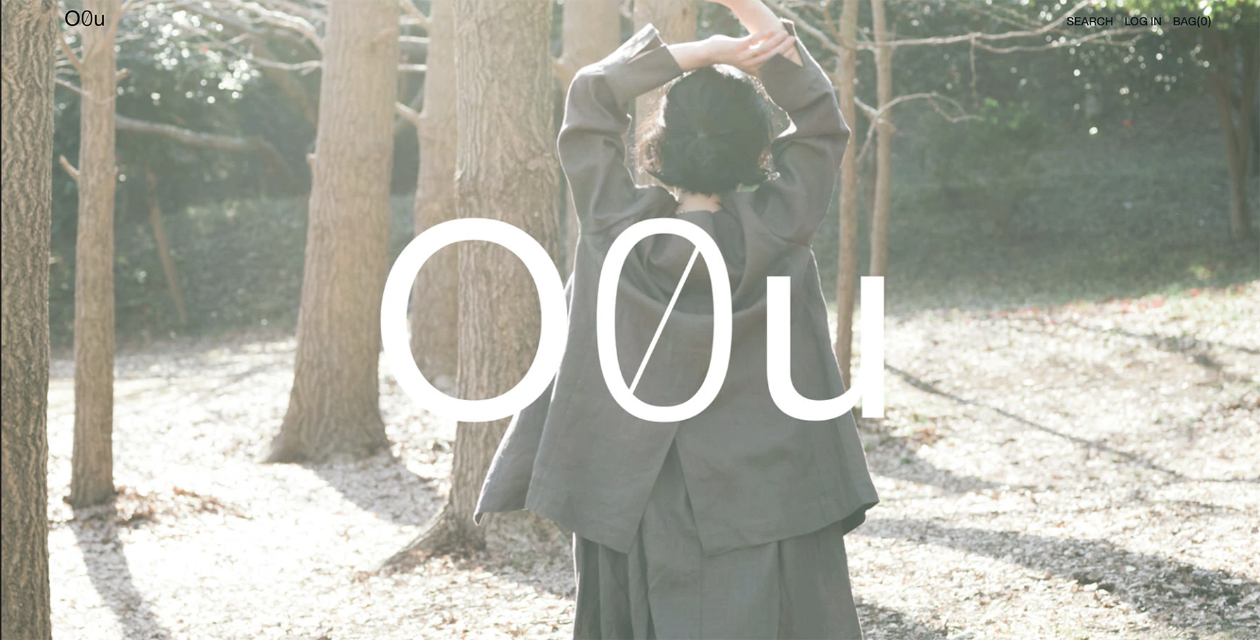
Next, we thought about the visual identity, the brand name and logo. As a brand proposing a “new normal,” we decided to challenge the way the name was made. We wanted to create a more neutral expression that would be closer to the lives of various people. We wanted to create a name that would be accepted more naturally by more people, without pushing the philosophy too directly. With that in mind, we first separated the letters from their “meanings” and saw them as “symbols”.

Under the art direction of Shin Maruyama, who works on typography and visual communication design in Japan and overseas, we decided on “O0u (Oh, Zero, You)” after many discussions. The combination of the three characters that look like different circles represents the diverse beauty, the way the product changes along with the lifestyle, and the circular society that exists as an extension of that. By making it a symbol, we also put meaning into supporting the diverse personalities of the wearers beyond the boundaries of race, gender, age, ideology, lifestyle, etc.
As a brand that debuted without a physical store, O0u needed to be creative in interacting with users and building fans. After the launch, we began distributing the web magazine “ME & THE EARTH”. The magazine’s primary stance is to learn about environmental issues and their solutions together with consumers, as an extension of our own lives.
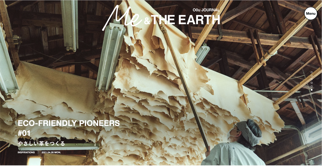
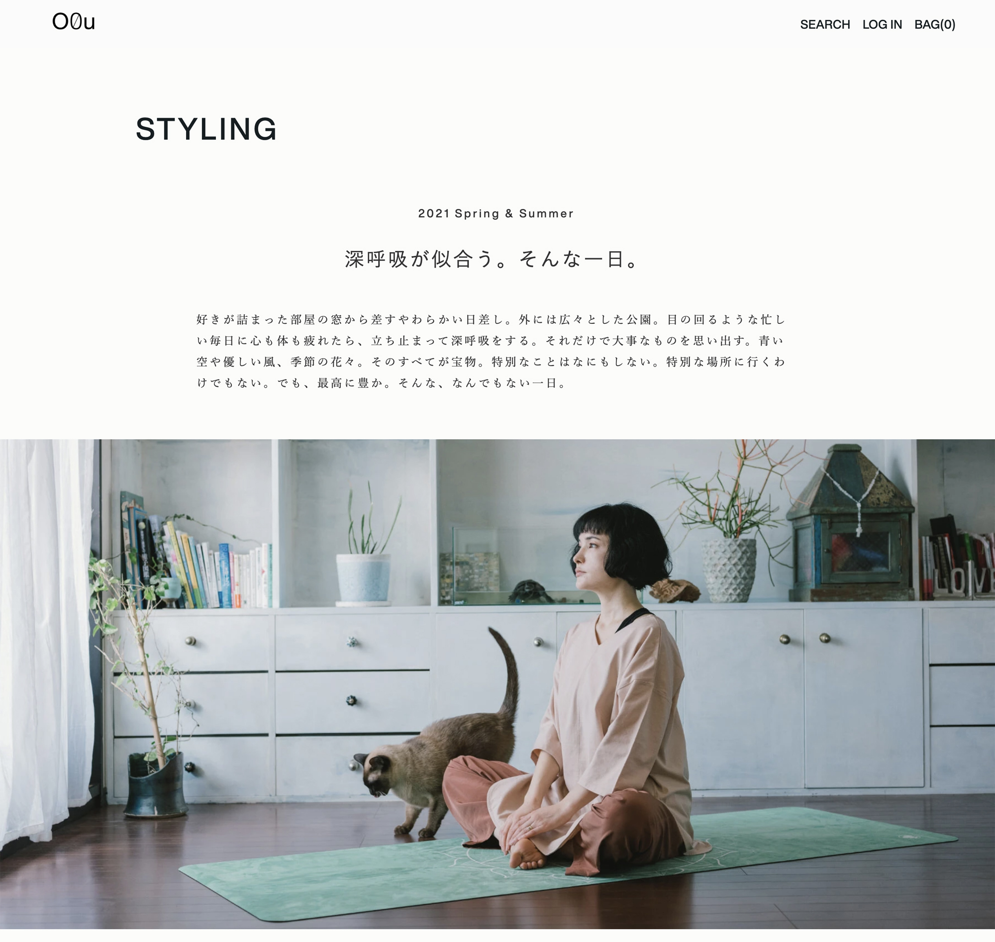
The EC site emphasizes comfort as its “A-side,” while the owned media conveys the brand’s philosophy as its “B-side.” In addition to the brand site, KESIKI is responsible for concept planning and editorial direction, and is developing as a media that communicates the philosophy that the brand values.
- client : ADOORLINK(ADASTRIA)
- Strategic Partner : Roland Berger
- Art Direction : &Form
- Web Design : Semitransparent Design FRACTA
- Editorial Partner : exwrite
- Digital Marketing Partner : DeeTeller
Learning
“Sustainability” has become a term that accompanies anything related to the business scene. However, there are still many people who do not personally understand sustainability as an ordinary consumer. This project confronts the difficulty of that issue head-on. Rather than conveying a thorough policy or obsession directly, we believe that converting it into a soft communication rooted in “fun” and “comfort” is the key.
